Shiny App
Introduction
Shiny is a web application framework originally from the R programming language. It allows developers to create interactive web applications directly from code. We have developed the pipeline in LAP and perturbation tutorials into Shiny applications that allow users to interactively explore the results of the analyses. In this tutorial, we will walk through the basic steps to perform those two types of analyses in Shiny. Check out the original notebook for more details on the theory and results analyses. (LAP and perturbation)
Prerequisites
To start the Shiny app, ensure that you have the Python version of Shiny installed. You can install it from PyPI:
pip install shiny
or conda forge:
conda install -c conda-forge shiny
Detailed instructions for installing Shiny can be found here. To successfully perform the analyses, you will also need to have a processed dataset just like what we showed in the previous tutorials. Here we use the dyn.sample_data.hematopoiesis() as an example.
In silico perturbation experiments
To run the in silico perturbation app in Shiny, you can run the following code:
import dynamo as dyn

adata = dyn.sample_data.hematopoiesis()
dyn.shiny.perturbation_web_app(adata)
Then you can find the address of your shiny app from the output. By default, it is http://127.0.0.1:8000. Open the website you will see:
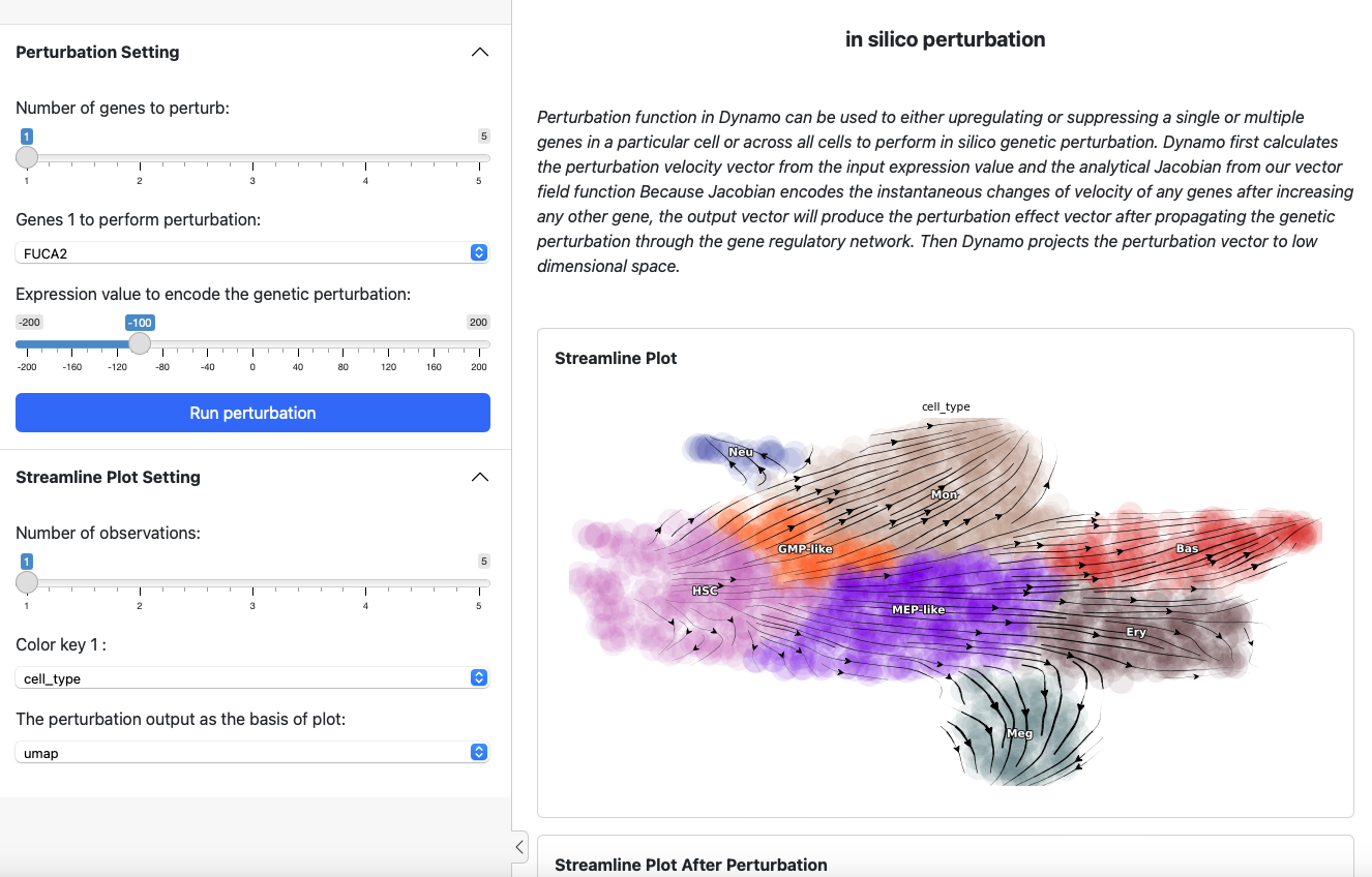
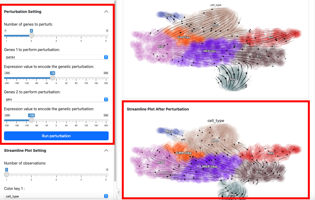
On the left side is the control panel where you can select the perturbation experiment you want to perform. On the right side is the streamline plot before and after perturbation.
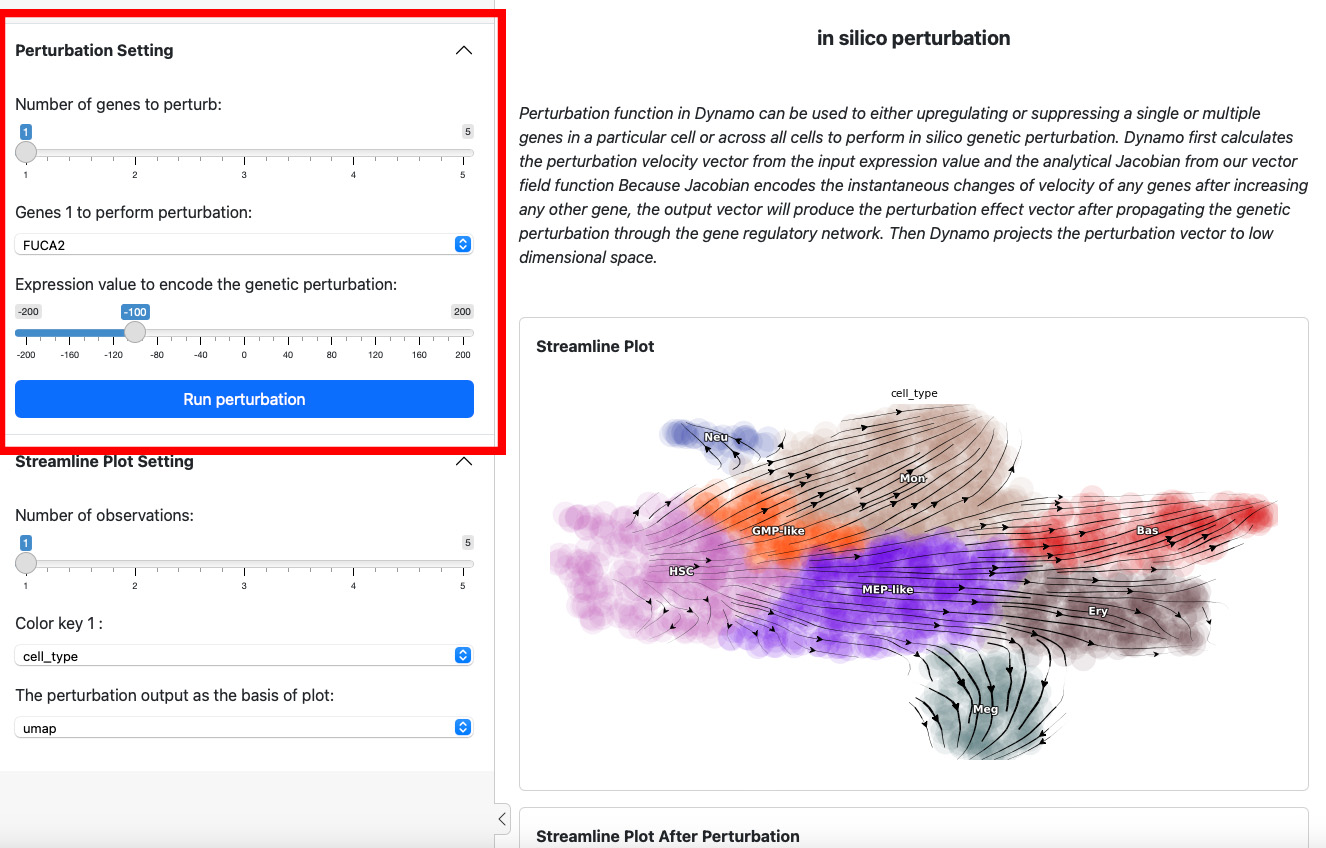
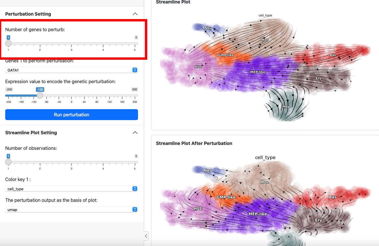
To start a perturbation experiment, manipulate the parameters in the first panel. The slider on the top controls the number of genes to perturb. Each gene will have two parameters, gene name and the expression value of perturbation. For each gene, specify its name and the corresponding perturbation expression value. Once you have completed the selection or input of genes and values, click the Run Perturbation button to start the experiment. The result will be on the right side of the screen under the title “Streamline Plot After Perturbation”.
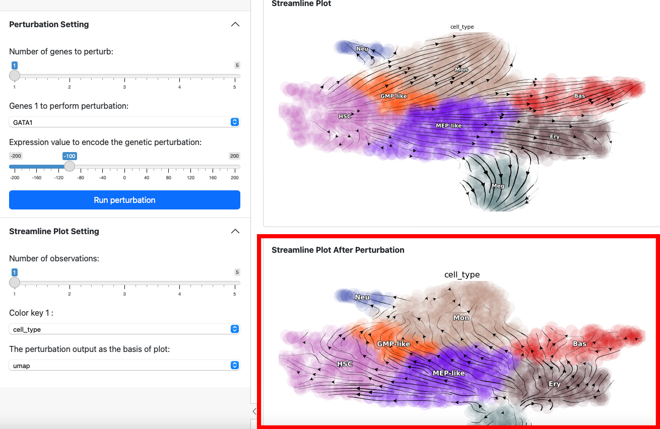
Here we suppress the expression of GATA1 by 100. The streamline plot shows that the suppression can divert cells from GMP-related lineages to MEP-related lineages. This aligns with the fact that GATA1 is the master regulator of the GMP lineage.
Next, let’s add one more gene through slide bar to perform a double suppression experiment.
Here we suppress both SPI1 and GATA1 cells. Click the Run perturbation button to perform the experiment again. The result reveals a seesaw-effect regulation between SPI1 and GATA1 in driving the GMP and the MEP lineages. This is consistent with the fact that SPI1 and GATA1 are two master regulators of the GMP and the MEP lineages, respectively.
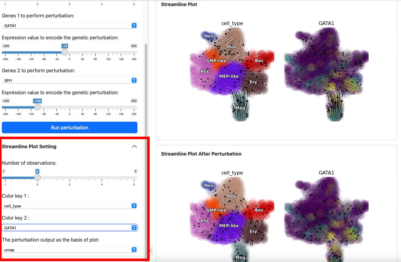
The control panel below can be used to change the parameter of the streamline plot. For example, you can add one more color GATA1 to the plot. Results will be displayed immediately on both views.
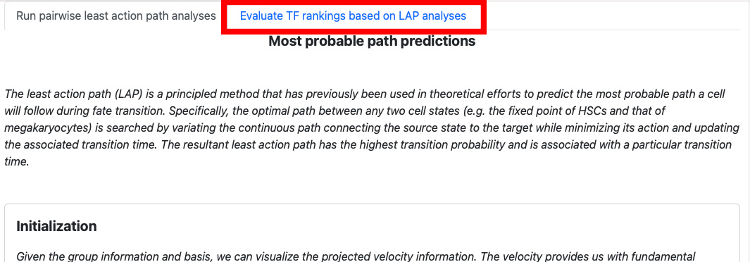
Most probable path predictions
Similar to the perturbation app, you can run the most probable path app in Shiny by running the following code:
import dynamo as dyn

adata = dyn.sample_data.hematopoiesis()
dyn.shiny.lap_web_app(adata)
Please be aware that the second part of the app, “Evaluate TFs ranking based on LAP analyses”, requires transcription factors (TFs) information. You can specify the information in the second argument of the function. Here we use the example data dyn.sample_data.human_tfs().
human_tfs = dyn.sample_data.human_tfs()
dyn.shiny.lap_web_app(adata_labeling, human_tfs)
If you don’t have the TFs information, you can still proceed with running the first part of the app.
Part 1: Run pairwise least action path analyses
On the top of the app, you will see the streamline plot illustrating the velocities of the given dataset.
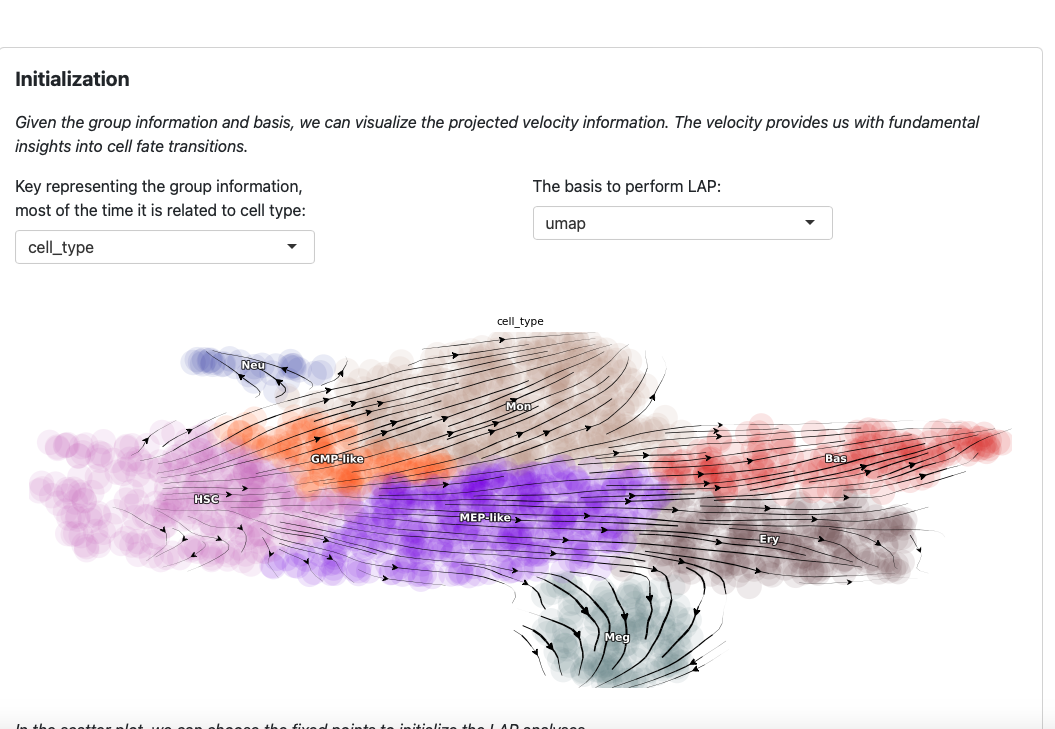
You can modify the group key and basis to explore different perspectives. Note that these two parameters are also used in the LAP analyses.
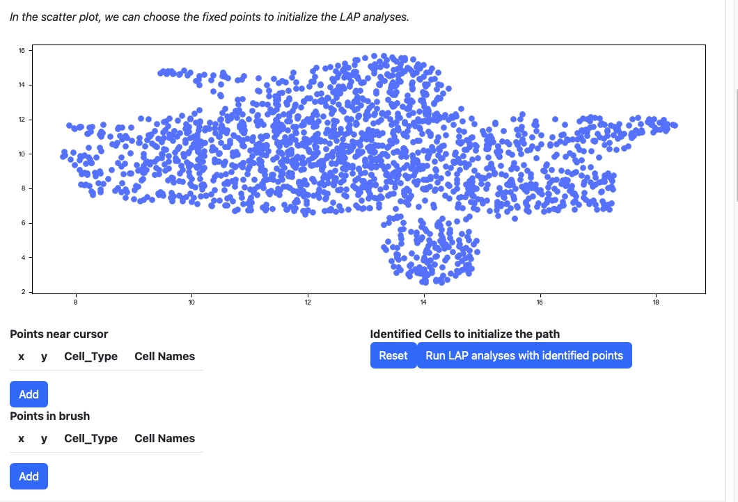
Scroll down to the scatter plot. You can manually select cells to initialize the LAP analyses.
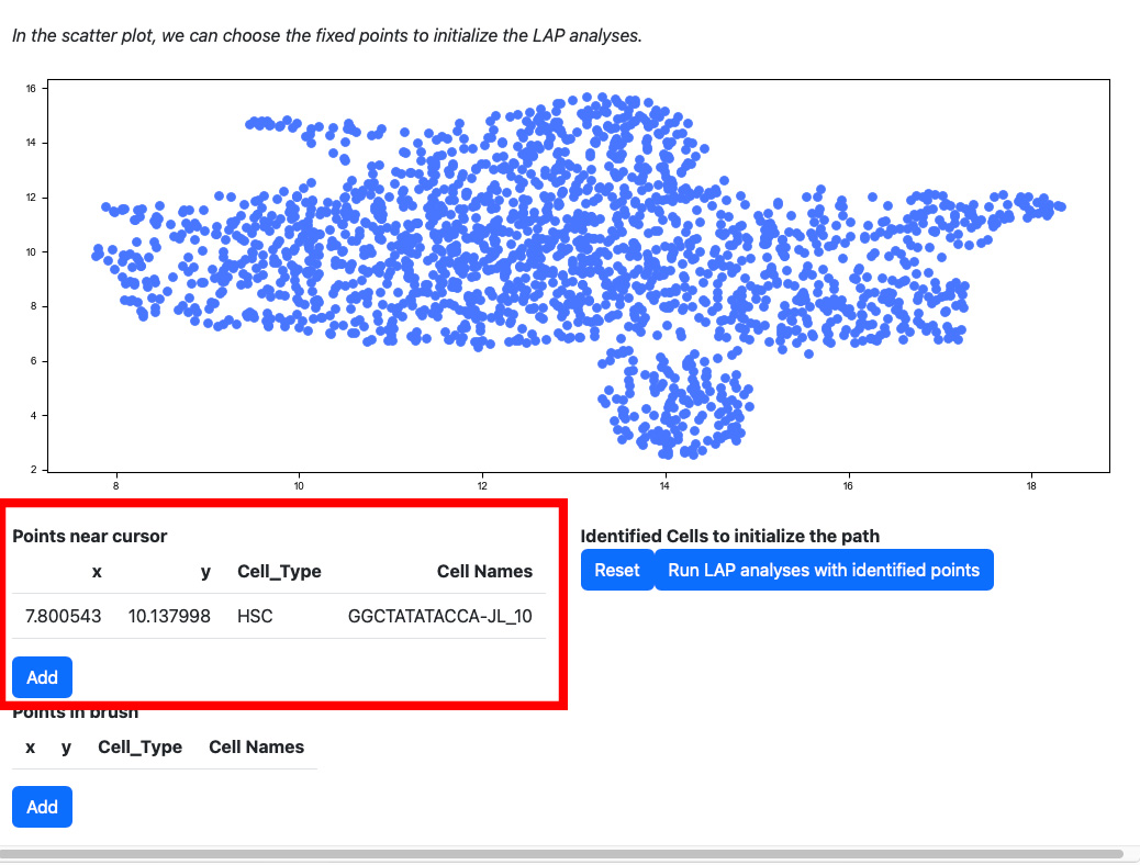
Click any cells on the scatter plot; the detailed information of the cell selected will be displayed on the table “Points near cursor”.
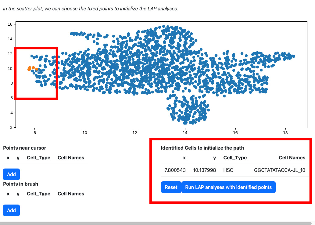
Click the add button if you are satisfied with the selection. The selected cells will be displayed on the right table. At the same time, the scatters will be updated with the selected cells and their nearest neighbors.
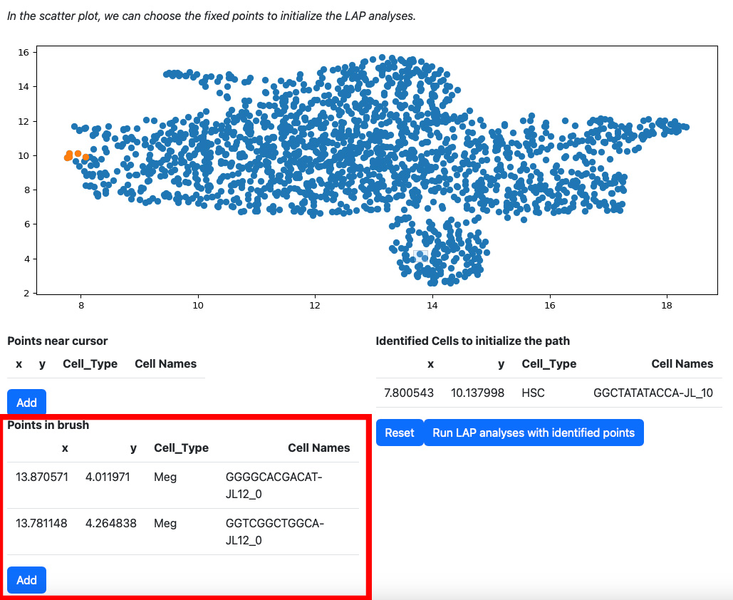
Alternatively, you can draw a rectangle on the plot to select cells. The selected cells will be displayed on the table “Points in brush”.
Then add them to the table on the right.
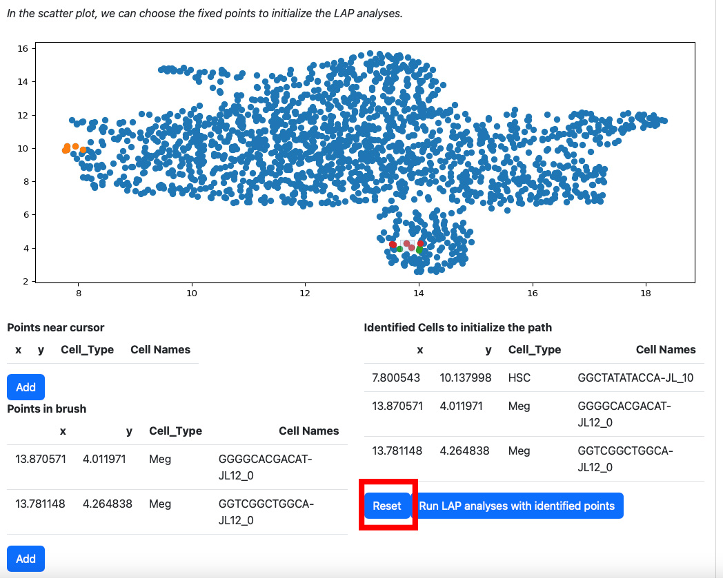
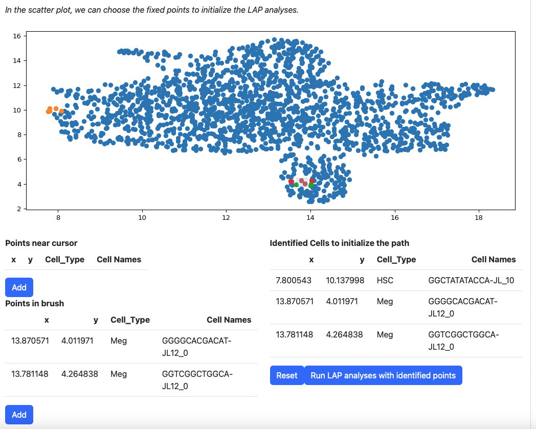
If you are not satisfied with the selection of cells in the table “Identified Cells to initialize the path”, you can click the reset button.
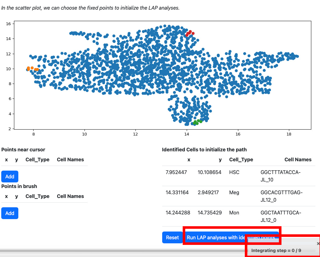
All points will be removed from the table. You can start over again. Considering the running time, here we select three cells for cell type HSC, Meg, and Mon for illustration. LAP analyses on all cell types can be found in the tutorial “Most probable path predictions”. Click the “Run LAP analyses with identified cells” button to start the analyses. You will see a progress bar on the right bottom corner of the screen. After the analyses are done, the results will be displayed in the following sections.
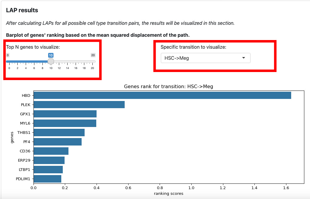
The first section is the ranking of genes for each transition. The slider on the left is for the number of top genes to display. The text box on the right is for the selection of transition.
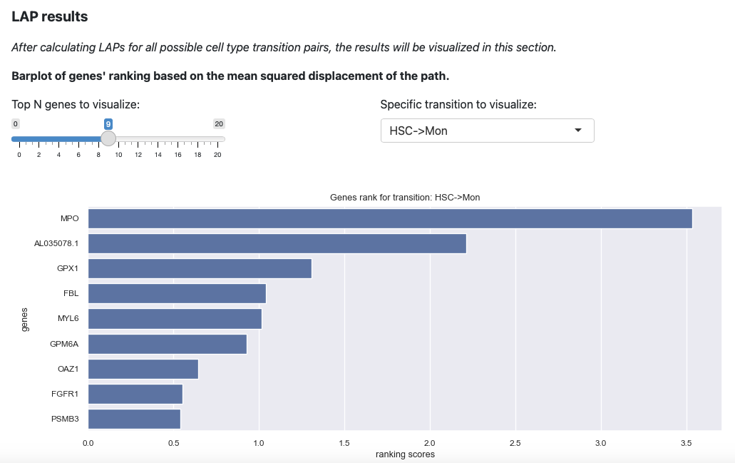
Here will select the transition HSC->Mon and top 9 genes. The plot will be updated immediately.
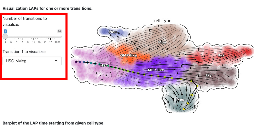
The next section is the visualization of the path. The control panel specifies the number and name of transition.
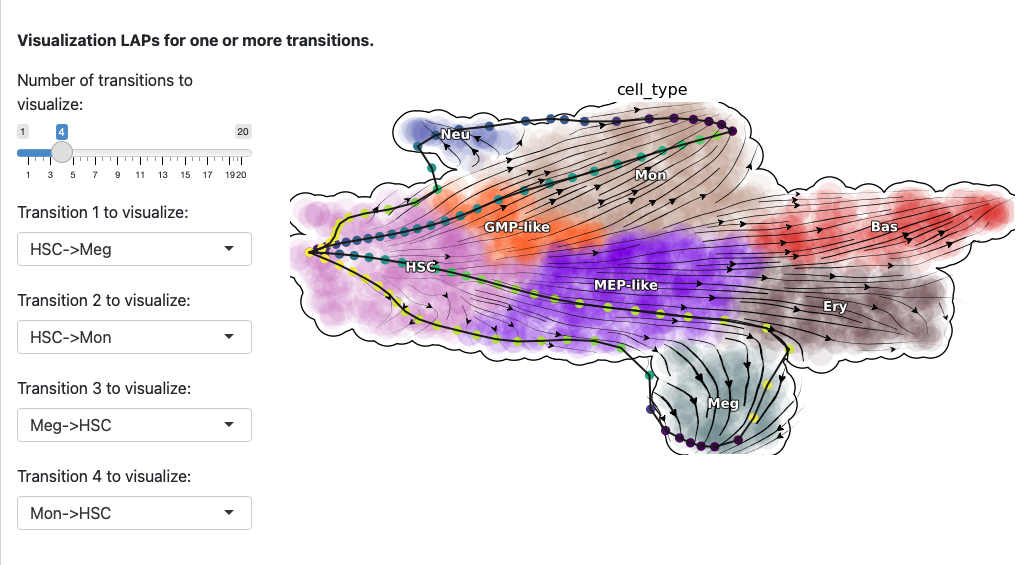
Here we select both the development and reprogramming transitions. The corresponding least action paths will be updated in the plot.
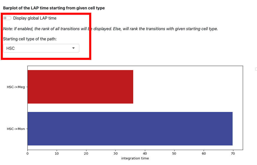
This section displays the LAP time barplot for the path originating from the specified cell type. Since we used the metabolic labeling based scRNA-seq, we are able to obtain absolute RNA velocity. Consequently, we can predict the actual time (with units of hour) of the LAP, which is a remarkable feature derived from the labeling data.
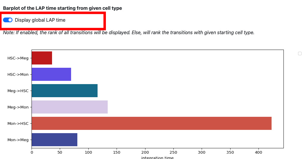
If we enable the global LAP time, we can see the barplot of all transitions.
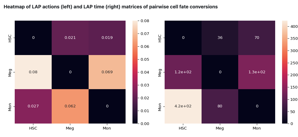
The following heatmap is the visualization of the transition matrices of actions and LAP time between all pair-wise cell type conversions with heatmaps.
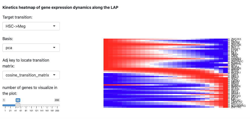
The last section is the kinetic heatmap of the given transition. You also need to specify the key of the transition matrix in the AnnData object. More explanation can be found in the API page of the dynamo.pl.kinetic_heatmap().
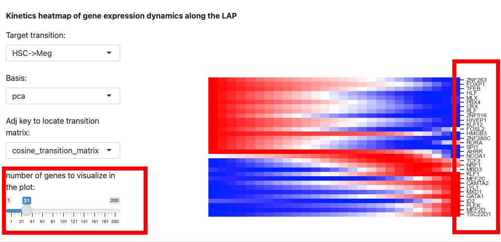
Since the space is limited, it is difficult to identify the gene names on the right. Thus, we reduce the number of genes to visualize.
Part 2: Evaluate TFs ranking based on LAP analyses
The second part of the app is to evaluate the ranking of transcription factors based on LAP analyses. Remember that you need to specify the transcription factors information when initializing the app.
First, navigate to the top of the page and select the second tab to switch to the second part of the app.
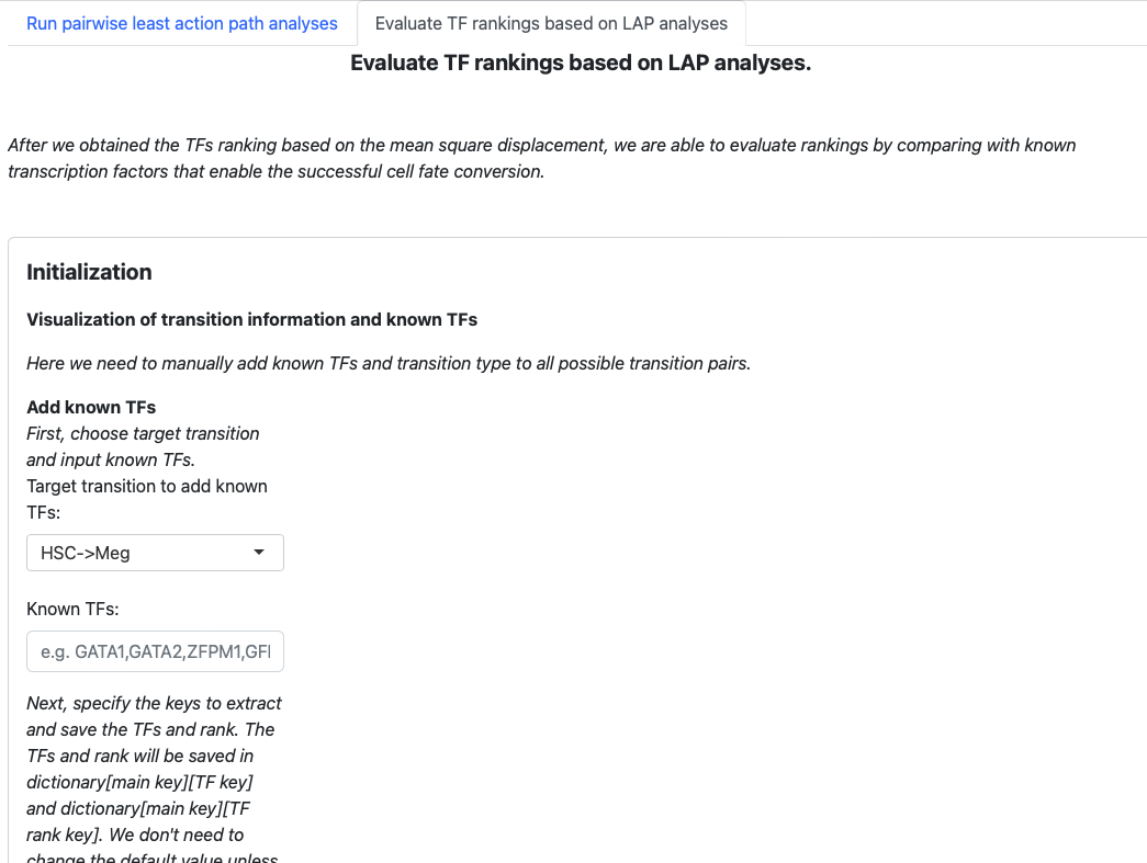
The structure is similar. Begin with an initialization page to input known transcription factors, and the subsequent sections will visualize the results.
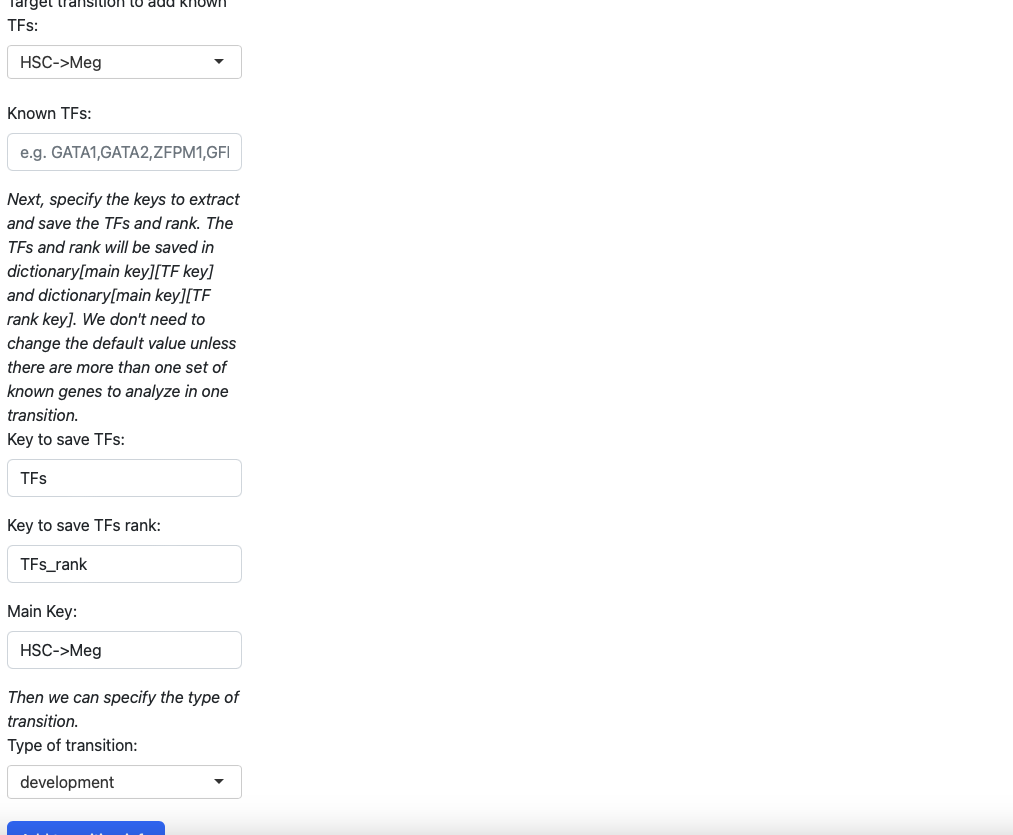
In the initialization page, you need to type in the transcription factors manually. You also need to specify the type of transition (development, reprogramming, or transdifferentiation). All those pieces of information will be saved in a dictionary, just like the tutorial “Most probable path predictions”. There is no need to modify the default value of “Key to save TFs”, “Keys to save TFs rank” and “main key” unless you want to specify multiple groups of transcription factors for one transition.
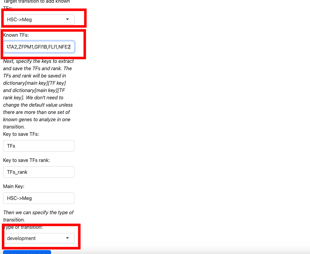
Here we add known transition factors to HSC->Meg and specify it as a development transition.
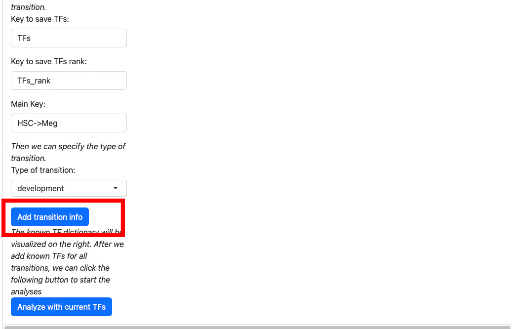
Click the “Add transition info” button.
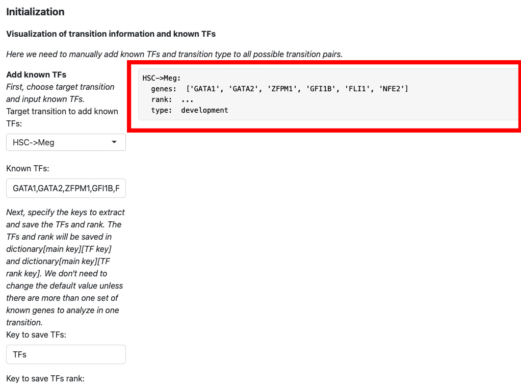
The transition information will be displayed on the right.
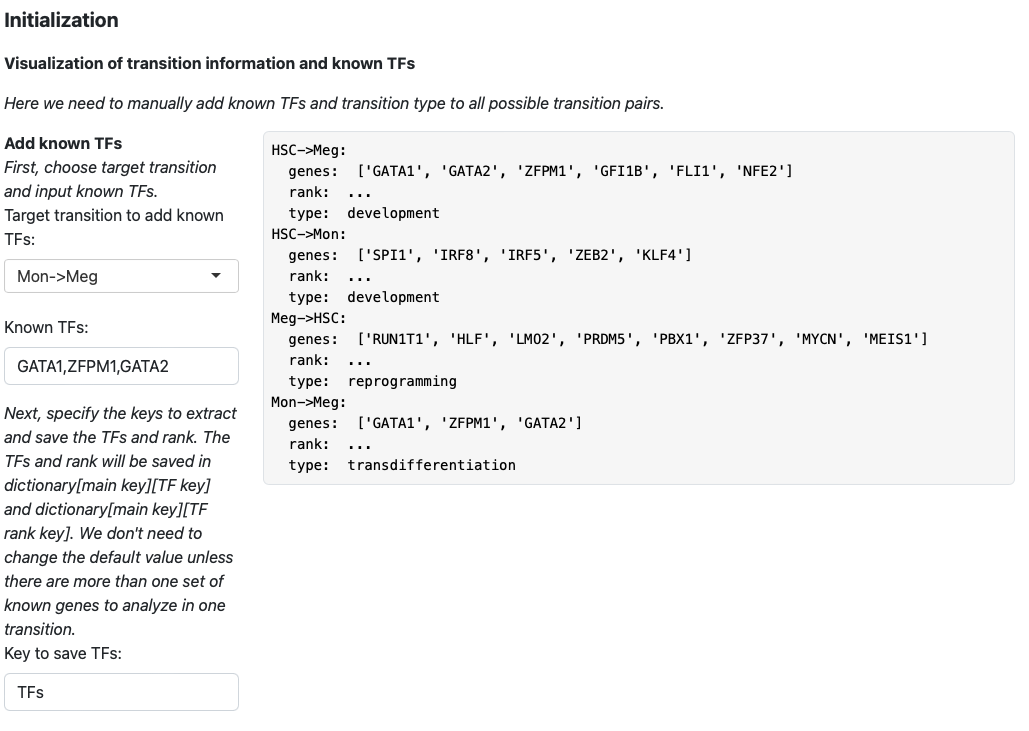
Then we keep adding transition information for HSC->Mon, Meg->HSC, and Mon->Meg.
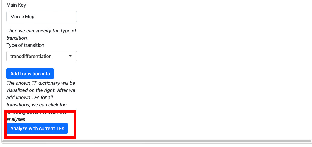
Once adding all transition information, click the “Analyze with current TFs” button.
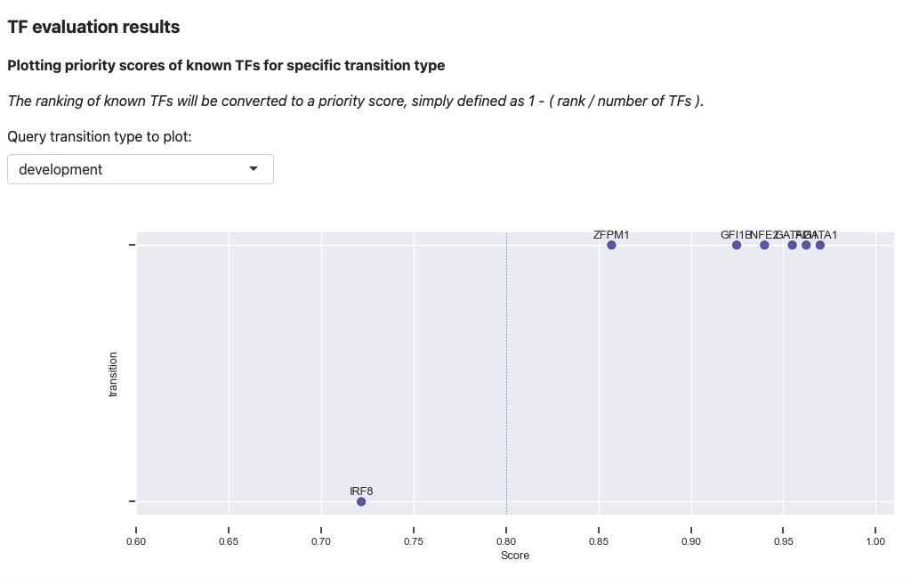
The first plot is the visualization of priority scores. Here we will convert the rankings of known TFs to a priority score, simply defined as 1 - rank / number of TFs. From the above plot, you can observe that our prediction works very well. The majority of the known TFs of the known transitions are prioritized as > 0.8.
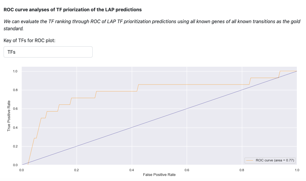
Last visualization is the receiver operating curve (ROC) analyses of LAP. ROC curve evaluates the TF prediction when using all known genes of all known transitions as the gold standard. The result illustrates that LAP predictions and TFs prioritization work well.